For my weekly work, I decided to work on gathering data and using that to find the mean, median, and mode of a set of numbers. I found examples of graphs that could be used in a classroom that would help visually display data to be able to easily figure out math problems from. By collecting data in the form or charts or graphs, information can be easily understood rather than just listing numbers from the results.
To incorporate gathering data into a math classroom, there are many ways to create activities that students could do to collect amounts of data and display the results in bar graphs, line graphs, or pie charts. In a lesson
plan, I would first teach the students the different ways to display data by showing them how to make the different the graphs. I found a website called “create a graph,” that would be a very useful thing to introduce to students so they would be able to use technology rather than drawing by hand. This would be more for the upper elementary students but would be an effective way to create an understanding of data collection and math.
plan, I would first teach the students the different ways to display data by showing them how to make the different the graphs. I found a website called “create a graph,” that would be a very useful thing to introduce to students so they would be able to use technology rather than drawing by hand. This would be more for the upper elementary students but would be an effective way to create an understanding of data collection and math.
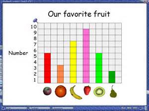
Mean: 5+3+7+9+5+2= 31 31/ 6= 5.16 rounded= 5 =5
Median: 31/ 2= 15.5 = 16 strawberry
Mode: Strawberry
occurs the most
Median: 31/ 2= 15.5 = 16 strawberry
Mode: Strawberry
occurs the most
The information from the graph above could be an example of how to find the mean, median, and mode in a classroom. This would be a good activity because the students would relate because they would be picking their favorite fruit and solving math from gathered data. The mean of this data was found by
adding all of the fruit amounts and then dividing by six and the answer rounded to five. The median was found by figuring out the middle number of all the fruit. There was 31 pieces which I divided by two and then found the middle to be six. The mode was found by finding the fruit that appeared the most which was a strawberry.
adding all of the fruit amounts and then dividing by six and the answer rounded to five. The median was found by figuring out the middle number of all the fruit. There was 31 pieces which I divided by two and then found the middle to be six. The mode was found by finding the fruit that appeared the most which was a strawberry.
 RSS Feed